
Showing posts with label Research and Planning. Show all posts
Showing posts with label Research and Planning. Show all posts
Wednesday, 23 March 2011
Wordle for my Digipak.
This is the Wordle I created for the audience feedback relating to my digipak.


Wordle For Audience Feedback for Music Video
This is the wordle I created for my audience feedback evaluation.

Thursday, 20 January 2011
Completion of Music Video
Today was the final lesson for completing our music videos. We started off watching what we had done and came up with ideas of what to fill the gaps with. We added a few extra shots, but then realised we had used them before. After filling in all the gaps and looking back over the footage we noticed that the shots were either being repeated or weren't in chronological order. So Josh and I took it on ourselves to put things right whilst Mackenzie was indisposed. After a while of changing and replacing shots we finally finished and looked back over our music video. There were a few tweaks needed which were sorted out, but we have finally finished our music video. We hope to get good feedback and have it uploaded as soon as possible.
Monday, 17 January 2011
Webpage update
During today's lesson I edited my webpage by changing an image of tour dates to the front cover of my digipak as it was more appropriate due to the tour dates being over. This gave the webpage brand identity.
Completion of Digipak
During today's lesson I completed my digipak and edited my webpage so that both had brand identity. I completed my digipak by adding lyrics of my song to my inside left page; I did not include the title of the song but I did include a signiture from the band so it was more personal. Furthermore, I added my logo to the bottom left of my back cover, so that it was similar to my webpage. On my webpage there used to be purple lightening bolts within the title banner, yet they served no purpose and were not related to my music video or digipak. From this I decided to change the purple lightening bolts to the blue 7:00 which is on the front cover of my digipak. I did this because it created brand identity for the band and also stuck to the conventions of a webpage and digipak.
Monday, 10 January 2011
Digipak Progress
During today's lesson I got on with my digipak and edited my track list as it was pointed out that people may not want to buy just one song, so I addd the original, a raiod edit and an acoustic version. I am still currently waiting an image of Mackenzie standing on his own in a park at night, much like a scene from our music video. I hope to get this by next lesson.
Wednesday, 5 January 2011
5th January 2011 - Editing
Today we carried on editing our music video and we found that we did not have enough shots to fill our blank gaps so we have decided to film an extra shot to fill these in. Beccy decided to add in a quick shot so it was barely noticeable but when she added the shot it seemed out of place and more like a glitch than a part of the video. After a while we could not find any other footage to put in the blank spaces so we called it a day.
Monday, 6 December 2010
CD/Digipak cover design
 This is my design layout for my CD/Digipak.
The layout goes as follows:
- Top left is my back cover
- Top right is my front cover
- Bottom left is my inside back cover
- Bottom right is my inside front cover
The top left image is of a cloudy night sky with a moon.
The top right image is of an alarm clock which is related to our video.
The bottom left image is of our lead singer (Mackenzie) standing alone in our setting at night.
The bottom right image is of our setting on it;s own at night.
Friday, 3 December 2010
First Ideas for CD/Digipak Design
Cover:
Images to represent band (The Courteeners)
Album/single name
Back:
Track list
Logo
Inside Cover:
A few images to represent the band
A message from the band
Words to songs
Image of band, posed and live
For all sides:
Specific colour scheme to represent the band/genre
Same font style as on webpage
Images to represent band (The Courteeners)
Album/single name
Back:
Track list
Logo
Inside Cover:
A few images to represent the band
A message from the band
Words to songs
Image of band, posed and live
For all sides:
Specific colour scheme to represent the band/genre
Same font style as on webpage
Conventions of a CD/Digipak
Conventions of a CD/Digipak are:
- CD inside
- Images
- Colour Scheme
- Track list (back cover)
- Barcode
- Album name
- Insert inside cover
Thursday, 2 December 2010
Music Video Idea Change
We have changed our idea of our song slightly as we have got further with our filming. We have stuck to the idea of Mackenzie being followed through a park and the part where he is sitting on a bed singing, but we have changed the idea of rewinding all of the previous footage to go back to the beginning. We decided to change this because it did not go with the song. We changed this to having a shot of leaves being blown across the floor at the quiet part of the song and then the image fading out to when the music starts up again. We thought that this fits in better with all the footage we have and it goes with the song. We will be filming this scene next as it is the last of our footage needed.
Monday, 29 November 2010
Comparison of Two CD Covers; The Editors vs. The Killers

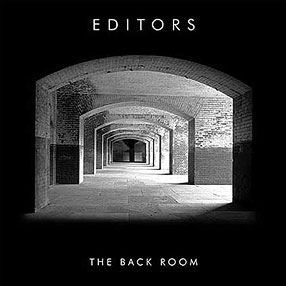
The Editors and The Killers are both bands within the indie genre an target the same audience; ages 16-30. Although they are from the same genre, they are not completely the same in being effective in attracting their target audience through iconography. For example, The Editors use an image of a empty space to represent their music whereas The Killers use an image of themselves to represent their music.
Another factor which is different between the two album covers is the use of different font styles. The Editors use a simple font which is still effective as the white stand out on the plain black background. Whereas The Killers use their own style of font which is made from small circles accumulating to form the words 'The Killers'. Furthermore, the font style for the album name is different as The Editors use the same font for their album name as their band name, but The Killers use a more formal font style for their album name in comparison to their band name which is unique to them.
I believe that The Editors album cover is more effective in engaging the target audience as it leaves more to the imagination of what their music might be like and what genre they may be part of. Furthermore, The Killers album cover is more representative of the band rather than what their music is like whereas The Editors album cover is simple like their music choice.
Overall, from this comparison and the previous analysis of these album covers I have learnt that by sticking to the conventions of a CD cover you can be effective even if your design is simple.
CD Cover Analysis

1) What is the genre of music?
The genre of music for this band 'The Killers' is indie, much like my chosen band 'The Courteeners' as well as the other bands I've chosen to use for CD cover analysis.
2) Who is the target audience? How are they targeted?
The target audience for 'The Killers' is generally ages 16 - 25. They are targeted through the use of the colour scheme and images to attract their attention.
3) How successful is iconography used to promote the artist?
This album cover is much like most other indie band album covers by being simplistic and the use of iconography is individualistic to the band and is easily recognised by the audience. Furthermore, the band is shown on the cover and so are easily recognised as being represented by their music as well as their image.
CD Cover Analysis

1) What is the genre of music?
The genre of music for this band 'The Courteeners' is indie.
2) Who is the target audience? How are they targeted?
The target audience for 'The Courteeners' is generally ages 18 - 25. This age range is closer as the use of lyrics is sometimes explicit and not suitable for people under the age of 18. They are targeted through the use of the colour scheme and images to attract their attention.
3) How successful is iconography used to promote the artist?
This album cover is much like most other indie band album covers by being simplistic and the use of iconography is individualistic to the band and is easily recognised by the audience.
CD Cover Analysis

1) What is the genre of music?
The genre of music for this band 'The Editors' is indie, much like my chosen band 'The Courteeners'.
2) Who is the target audience? How are they targeted?
The target audience for 'The Editors' is generally ages 16 - 25, and they are targeted through the use of the colour scheme, iconography and simplicity of the album cover.
3) How successful is iconography used to promote the artist?
The iconography of this album cover is used effectively to promote the artist as it is simple, yet still attracts the attention of the audience through the use of a captivating image.
Wednesday, 24 November 2010
First day of editing - 24/11/10
Today only two members of the group were in so we decided to edit. The two group members were Beccy McTaggart and myself. We used final cut to edit our raw footage. We decided to look at all our raw footage first to see which clips we needed and which we could delete. Once this was decided we then realised that some of our clips were too dark so we added an effect to make them brighter. We then tried to put them in chronological order from our first shot to our last, but since making a few clips brighter took some extra time we did not get round to putting all our clips in chronological order. For one of our clips we added a CCTV effect which gave the shot a night vision effect; this was helpful as it showed the shot from a different persepctive. Overall, our first day of editing was time consuming as expected but a good experience as we now know what we can do to give our music video a different feel to it.
Thursday, 18 November 2010
Blog update - 18/11/2010
How have you used web page conventions to create brand identity?
For my webpage I have used web page conventions by embedding a video of my chosen band, made the navigation bar easy to use and everything entirely visible, including the text, pictures, and layout. For example, I have put my video at the top of my web page to attract the audience to this and it is situated next to my text so whilst they listen to my song they can read information on the band. To do this I went on the widgets section in iWeb, dragged a youtube link and then embedded my chosen video. The use of web page conventions reinforces the iconography of the band as the colour scheme is relevant to the indie genre and the layout is simple yet effective by making you look at everything when on the web page.
Wednesday, 17 November 2010
Filming the Stage Scene - 15/11/10
Today we filmed Mackenzie walking onto the stage from behind a curtain. We did this shot approximately 6 times, all from different angles. We did it this many times because we needed different angles to see which would be best, and then conjoin them in editing to make it obvious he was on his own. The first few shots were straight on of Mackenzie walking from behind the curtain to behind the mic. The next few were of a side view of Mackenzie doing the exact same thing. We decided to then do a steadycam shot going around Mackenzie. We did this twice but the footage showed it was too shaky when looking back at it, so we decided to forget this shot and stay with what we have. We then moved onto doing a shot of Mackenzie walking down some stairs, unfortunately the camera was not charged and so the battery went flat before we could film this part. We aim to do this another day with a fully charged camera.
Filming the Park Scene - 16/11/10
Today we filmed the scene where Mackenzie is being followed by a big group of people through a park. When we got to the park it was quite dark, but the park was lit so we could still see what we were filming. We started by filming Mackenzie and some other people walking from behind the camera to in front of it and then away in to the distance. We did this shot once as it was done well first time. We then moved on to doing the same thing but from a different angle. This shot took two takes as the first did not go as well as planned. After this we moved onto the same shot but from another different angle. This shot also took one take as it went well first time. After this we moved onto a a different angle which we stood on top of a skate ramp to film from a high distant angle. This shot was good as it gave the scene a different perspective even though they did the same thing as before. We did this take twice as the first was not how we wanted but the second went well. We then moved onto a front view shot, so Mackenzie and the people following would walking towards the camera. This shot took one take as it went well and looked good when looking back at it. Our penultimate shot was of Mackenzie and the group walking down an alley. This took two takes as the first shot was not what we wanted, yet the second was. Our final shot was a high angle which we would edit into a CCTV looking shot. This took three takes as the first was ruined by smoke, the second a dog ran out in front of the scene and the last was the best take.
Subscribe to:
Posts (Atom)